
Understanding Forex Trading Signals in South Africa
📈 Learn how forex trading signals help South African traders make informed decisions. Discover types, costs, risks, and tips for smart signal use in FX trading.
Edited By
Sophia L. Draper
Forex trading graphs are your window into the ever-shifting foreign exchange market. These charts give a clear visual of price movements over time, which is crucial when deciding when to buy or sell currencies like the rand (ZAR), euro (EUR), or US dollar (USD). For South African traders juggling local factors such as Eskom loadshedding or fluctuating economic data, understanding these graphs helps in spotting both opportunities and risks faster.
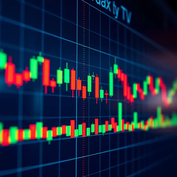
There are several types of forex charts—each with its own strengths. Line charts, the simplest, connect closing prices to reveal the general direction of a currency pair. But they don’t show much detail. For more insight, candlestick charts are favoured; they display open, close, high, and low prices for a given period, tracing clear price action patterns like hammer or shooting star that signal potential trend reversals.
Traders also keep an eye on popular indicators directly overlaid or beneath charts, such as the Relative Strength Index (RSI) or Moving Average Convergence Divergence (MACD). These help gauge whether a currency is overbought or oversold, adding weight to trading decisions.
Remember, no single chart or indicator guarantees success—every tool has to fit within a broader strategy, considering market news, economic events, and personal risk appetite.
To read forex graphs effectively:
Observe the time frame: graphs can range from minutes to months, suiting different trading styles from scalping to long-term investing.
Identify trends and patterns: rising, falling, or sideways movements each have specific implications.
Use indicators wisely: combine momentum and volume tools to confirm or question price moves.
Mastering forex trading graphs isn’t just about numbers or fancy visuals—it’s about making sense of the market’s rhythms to trade confidently. For South African traders, this means adapting charts to include local travel bans, commodity price swings, or political developments that often shift the currency landscape.
With this foundation, you’ll be ready to explore the main chart types, key indicators, and common patterns in greater detail.
Forex trading graphs are more than just squiggles on a screen; they are vital tools that give you a snapshot of market behaviour. Different graph types highlight various price details and time frames, shaping how you make decisions. Picking the right graph depends on your trading style and what info you want to extract quickly.
Line charts connect the closing prices from one period to the next with straight lines. For instance, if you look at a daily line chart for the ZAR/USD pair, you'll see a simple curve showing how closing prices have shifted each day. This simplicity helps traders quickly spot the overall trend without getting bogged down in the noise of intra-day price moves.
However, while line charts make trends clear, they omit important details like opening price, intraday highs and lows. This can mean missing out on volatility cues critical in forex where prices swing rapidly. Consider it like viewing a landscape photo: you get the big picture but might miss the smaller landmarks.
Bar charts provide a fuller picture of price action by including the open, high, low, and close prices for each time period. Picture a vertical line representing the range between the highest and lowest prices, with horizontal ticks showing the open (left side) and close (right side). This format helps traders understand daily volatility and sentiment shifts more sharply than line charts.
In choppy or volatile markets—like forex pairs during interest rate changes—bar charts shine. They clearly reveal price swings within each period, allowing traders to see whether buyers or sellers dominated the session. This insight is handy when deciding entry or exit points.
Candlestick charts look similar to bar charts but use coloured “bodies” to represent the distance between opening and closing prices, with “wicks” showing the highs and lows. A green (or white) candlestick shows the close was higher than the open, signalling bullishness, while a red (or black) one denotes a bearish move.
Traders favour candlesticks because the colours and shapes make it easy to spot patterns like dojis or engulfing candles, which hint at reversals or continuations. For example, a bullish engulfing pattern on a EUR/ZAR daily chart can suggest a potential price upswing. Candlesticks compress a lot of information into a visually intuitive format, making them a staple on most forex platforms.
When choosing between chart types, think about whether you want a quick trend overview with line charts, detailed price info from bar charts, or visually rich signals from candlesticks.
Each graph type has its place in a trader’s toolkit. Understanding their features helps you adapt your strategy to the market’s rhythm and your trading goals.

Being able to read forex trading graphs effectively is a skill every trader needs. These charts aren’t just lines or bars on a screen; they’re a visual record of market sentiment, price action, and potential future movements. For anyone trading forex, from beginners to seasoned analysts, mastering these charts helps in spotting opportunities and managing risks more confidently.
Support and resistance zones form the backbone of technical analysis. Support is a price level where a currency pair tends to stop falling because demand picks up, while resistance is where prices often pause or reverse after rising due to increased supply. For example, if the EUR/ZAR pair keeps bouncing back from R19.50, that level acts as a support. Traders typically place buy orders near support and sell orders near resistance, making these zones practical anchors for entry and exit points.
Meanwhile, trend lines and channels help clarify the market’s direction and momentum. A trend line is drawn by connecting successive highs in a downtrend or lows in an uptrend. If the USD/ZAR price keeps climbing along a rising trend line, it indicates a persistent uptrend. Channels add another layer by drawing parallel lines above and below a trend line, showing potential boundaries for price movements. Spotting when price breaks out of a channel can signal a shift in trend strength or reversal, prompting timely trading decisions.
Forex charts come in many time frames — from minutes to months — and each offers different insights. Short-term charts (like 5-minute or 15-minute intervals) are favoured by day traders hunting quick gains. They show detailed price swings but can include a lot of noise. Conversely, long-term charts (daily, weekly) suit swing or position traders focused on broader trends. For instance, a trader might spot a bearish daily trend in GBP/USD but identify a brief rally on the 15-minute chart to capitalise on a pullback.
Combining multiple time frames is a solid strategy that blends detail with context. A trader can start with a weekly chart to pick out the major trend then zoom into the 1-hour or 4-hour chart for specific entry points. This multi-level view reduces the risk of mistaking short-lived moves for lasting trends. It’s like scouting a koppie from afar before trekking up — the big picture guides the detailed steps.
Understanding price levels, trends, and time frames isn’t just theory — it sharpens your trading decisions and helps avoid costly mistakes. Every chart tells a story; the knack is reading it right.
Popular indicators help traders get a clearer picture of what’s happening behind forex price movements. When combined with forex graphs, these tools offer insights into trends, momentum, and market volatility, making your trading decisions more informed. For South African traders juggling factors like rand fluctuations and global economic news, using indicators alongside charts can improve timing and risk management.
Moving averages (MAs) smooth out short-term price noise, revealing underlying trends. The two common types are the simple moving average (SMA) and the exponential moving average (EMA). The SMA averages closing prices over a specific period, say 20 days, while the EMA gives more weight to recent prices, reacting faster to changes. For example, when the 50-day MA crosses above the 200-day MA, it signals a potential uptrend, called a "golden cross," often used to spot entry points. MAs are practical for SA traders during volatile periods, such as shifts in SARB interest rate policy, as they help avoid chasing erratic price swings.
The RSI measures the speed and change of price movements, signalling whether a currency pair is overbought or oversold on a scale of 0 to 100. Typically, readings above 70 suggest the market might be overbought, while below 30 indicates oversold conditions. For instance, if the rand-dollar pair RSI climbs to 75 during a rally, it might warn of a correction soon. RSI shines in identifying momentum shifts, especially useful around SA’s economic releases or unexpected news events, helping traders avoid jumping in too late or too early.
Bollinger Bands consist of a middle moving average with upper and lower bands set a fixed number of standard deviations away. These bands widen when volatility rises and narrow during calm periods. Imagine watching the rand versus euro tight range during low volatility, then suddenly the bands expand during a significant event like a political speech. When price touches or breaches the upper band, it might signal overextension; likewise, hitting the lower band could hint at a bounce. Bollinger Bands guide traders on when to expect bigger moves, assisting with setting stop losses or profit targets amid fluctuating market noise.
Combining indicators with forex graphs isn’t about having more signals, but about choosing complementary tools that clarify market behaviour. In the South African trading context, where external factors like commodity prices and loadshedding impact forex flows, making sense of these nuances requires more than just price visuals.
Using moving averages, RSI, and Bollinger Bands together offers a balanced toolkit for spotting trends, timing entries or exits, and managing risk. Practical knowledge of these indicators equips you to read charts with confidence rather than guesswork.
Chart patterns in forex trading serve as visual signals that can hint at future price action. Recognising these patterns helps traders anticipate potential market reversals or continuations, allowing for better-timed entries and exits. They are especially useful for South African traders who often navigate volatile markets and need reliable methods to reduce guesswork.
Reversal patterns mark potential turning points where an existing trend might come to a halt. The Head and Shoulders pattern, for example, forms with three peaks: the shoulders are lower than the central head. When this pattern appears after a bullish trend, it often signals a shift towards a bearish phase. Picture a ZAR/USD chart where the price rises steadily, then forms this shape, prompting traders to consider selling before further declines.
Similarly, Double Tops occur when the price hits a resistance level twice without breaking through, suggesting the uptrend is weakening. This pattern implies that buyers are losing steam, and sellers may take over. Spotting these reversal signals early could help avoid getting caught on the wrong side of the market.
Unlike reversals, continuation patterns indicate that the current trend will likely persist. Flags look like small, rectangular consolidations slanting against the prevailing trend. After a sharp move, the price pauses temporarily before resuming direction. For instance, a bullish flag during an uptrend in EUR/ZAR could warn traders to hold positions rather than exit.
Triangles—whether symmetrical, ascending, or descending—show a tightening price range, often leading to a breakout in the existing trend’s direction. Many local traders watch for triangle patterns during quieter trading hours when volatility drops, expecting a move once the pattern resolves.
Volume adds weight to pattern analysis. A breakout from a reversal or continuation pattern with high trading volume typically confirms the move’s validity. Without volume backing, a breakout may falter, resulting in a false signal. For South African markets, where liquidity can vary significantly—from major pairs like USD/ZAR to more exotic crosses—volume confirmation is key to avoid costly misreads.
Always check whether volume aligns with pattern breaks; this simple step can save you from chasing fake moves.
In sum, being able to spot and interpret reversal and continuation patterns alongside volume offers traders solid clues in forex markets. It’s a practical skill that, combined with good risk management, can improve your trading decisions and confidence.
Forex trading graphs offer vital clues for spotting opportunities in the market, but knowing how to use them effectively can make all the difference. This section covers practical advice to help traders avoid pitfalls, combine graph analysis with other tools, and stay nimble through shifting market conditions.
One frequent error is mistaking noise for trend. It’s easy to overreact to small price blips, especially in volatile pairs like USD/ZAR. For example, chasing every spike without confirming a clear pattern can lead to unnecessary losses. A good rule is to wait for confirmation signals, like a supported breakout or a trend line hold, rather than jumping in on every price movement.
Another common mistake is ignoring the time frame. Many traders focus just on short-term charts (like 5-minute graphs) and miss the bigger picture shown by daily or weekly graphs. This can lead to entering positions against the prevailing trend. Always cross-check multiple time frames to get a clearer view of where prices are headed.
Graphs work best alongside other indicators and analysis methods. For instance, combining moving averages with candlestick charts can help smooth erratic price data and reveal underlying trends. Likewise, using the Relative Strength Index (RSI) can highlight overbought or oversold conditions that aren’t obvious just from price action.
Risk management tools like stop-loss orders should also be an essential part of your trading system. They protect your capital if the graph's signals prove misleading. Plus, economic calendars showing upcoming South African Reserve Bank (SARB) announcements or global news events can help avoid trading during potentially disruptive periods.
Forex markets react sharply to news—be it SARB interest rate decisions, changes in commodity prices affecting the rand, or unexpected global events. Traders should adjust their chart analysis accordingly. For example, during periods of heavy loadshedding, market volatility might increase, making traditional levels less reliable.
It’s wise to scale down position sizes or temporarily avoid trading just before significant announcements. After the event, watch for chart patterns that indicate whether the market is stabilising or trending in a new direction. On days with low liquidity, price spikes can be exaggerated, so err on the side of caution.
Consistently applying these practical tips can enhance your ability to read forex graphs reliably and complement your overall trading approach.
Approach your charts not just with an eye for patterns, but with discipline, patience, and a good grasp on the external factors influencing the market. That’s how you turn raw graphs into actionable trading insights.
📈 Learn how forex trading signals help South African traders make informed decisions. Discover types, costs, risks, and tips for smart signal use in FX trading.
📈 Explore forex trading systems in South Africa! Learn how strategies, indicators, risk management & automation work together to boost your trading results.

🔍 Discover the essentials of forex trading in South Africa, from market basics and currency factors to smart strategies and risk tips for investors!

📈 Discover how free daily forex trading signals work! Learn to find reliable sources, interpret signals, and blend them with your strategy for smarter trades.
Based on 12 reviews